As a day trader, I rely on candlestick patterns to find the best trade setups for my strategy.
But how do I see the patterns? How do I determine my entry and exit points?
The simple answer: charts.
They contain huge amounts of information that’s easy to read fast. And I can use candlesticks for technical analysis.
If you want to learn to read candlestick charts in-depth, I suggest you join my Trading Challenge. In the meantime, here’s a primer on 20 candlesticks patterns to get you started on the right foot.
Table of Contents
- 1 What Are Candlestick Patterns?
- 2 Formation of Candlesticks
- 3 How to Read Candlestick Charts
- 4 Benefits of Using Candlestick Patterns Their Benefits
- 5 Types of Candlestick Patterns
- 6 20 Candlestick Patterns You Can Use While Day Trading
- 6.1 #1 The Supernova
- 6.2 #2 The Stair Stepper
- 6.3 #3 The Snore
- 6.4 #4 The Crow
- 6.5 #5 Shooting Star Pattern
- 6.6 #6 Hammer Doji
- 6.7 #7 Inverted Hammer Candle
- 6.8 #8 Spinning Top
- 6.9 #9 Three Line Strike
- 6.10 #10 Two Black Gapping
- 6.11 #11 Evening Star
- 6.12 #12 Morning Star
- 6.13 #13 Abandoned Baby
- 6.14 #14 Piercing Line
- 6.15 #15 Dark Cloud Cover
- 7 #16 Bullish Engulfing
- 8 #17 Bearish Engulfing
- 9 #18 Three Advancing White Soldiers
- 10 #19 Three Black Crows
- 11 #20 Double Top
- 12 Candlestick Pattern Cheat Sheet
- 13 The Bottom Line
What Are Candlestick Patterns?
A candlestick pattern is a price movement that you can graphically see on a stock chart.
Candlestick charts give you a ton of information. A candlestick shows you the opening, closing, high, and low prices for the specific time frame.
You can also see the general sentiment for a stock and whether buyers or sellers have the upper hand.
I personally use candlestick patterns because it’s easy to see patterns…
These chart patterns are like templates. The patterns don’t always look exactly the same … But they look similar enough that when you see them over and over, you realize they can repeat.
That’s when things can get really interesting.
And they have great names! We’ll get into specific patterns shortly. But first, let’s start with the basics: how candlesticks form.
Formation of Candlesticks
These days, candlesticks are formed using computer programs these days. They’ve been in use since 1989 in the Western Hemisphere. Prior to that, some Japanese traders had been using candlesticks for over 200 years.
That was long before the advent of modern computers. So traders would gather the data and draw the charts out longhand.
Lucky for modern traders, computers do all the hard work now.
Candlesticks represent specific time periods. You can use candles to show you one-minute, one-day, or even one-month time periods. Each candle shows you the price action for one trading period.
It’s one more reason to use the best tools, like a stock screener. StocksToTrade has awesome candlestick charts — all you have to do is learn how to read them. I helped design StocksToTrade, so it’s great for scanning and finding penny stock trading opportunities.
New to trading low-priced stocks? Get my free online penny stocks guide here.
How to Read Candlestick Charts

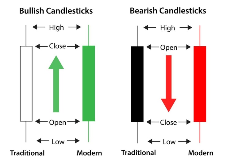
Reading candlesticks isn’t difficult once you know what you’re looking at. Candlesticks have three parts: the body, the upper shadow, and the lower shadow.
The body tells you three things:
- The opening price
- The closing price
- Whether the price went up or down
If the close is higher than the open, the candle will be green or white. This indicates gains during the session. If the close is lower than the open, the candle will be red or black.
The shadows look like candle wicks and show you the highest and lowest prices in a time period.
Check out my cheat sheet at the end of this post. Print it out and keep it handy as you learn these patterns.
Trending Candle vs. Non-Trending Candle
On candlestick charts, some candles continue or confirm a trend. These are trending candles. If a candle goes against the trend, it might be considered a non-trending candle.
You also may often see candles without an upper or lower wick or shadow. That means the open and the close were at the highs and lows of the given period. This could indicate a strong trend, support, or resistance.
You gotta read candlesticks in the context of the overall chart.
Multiple clean candles with little or no shadow signify a strong trend in one direction because the new prices are holding. An upper shadow means the new higher prices aren’t holding.
Candles with a long body moving away from a short shadow (a long green body, short lower shadow) also signify a trend. As do candles with a short body and long shadow…
… confused?
Don’t give up. I think I can make this easier for you. Check this out…
I’ll explain different types of candlestick patterns with examples below.
The important thing to remember is that candlesticks provide information about the trend. While they aren’t 100% accurate (trends change), they give you an idea of what to look for — and that’s an edge you want with your trading.
Benefits of Using Candlestick Patterns Their Benefits
How do you use candlestick patterns for day trading? What if I told you I had a trading tool that gives you all this information:
- Price action: weak or strong?
- Trend: bullish or bearish?
- Is there low or high testing of prices that got rejected?
- Is there a lack of buyers or sellers?
You might think that sounds like an awesome tool. That’s candlestick charts. You just have to learn how to read them … then put them to use in your trading.
Remember, there’s no one right or wrong way to trade. You have to figure out a pattern that works for you. Learning candlestick patterns can help you figure that out.
(Love chart patterns? You’ll love this one. Check it out with this no-cost webinar replay.)
Types of Candlestick Patterns
There are bullish, bearish, continuation, and reversal patterns.
Before you try to trade them, learn to spot them. Some are signals not to trade. And the trades you don’t take are often more important than the trades you do take. It’s all about the process.
Start with one and work on trading just that one pattern. Nail down one pattern at a time.
Bullish Candlestick Patterns
Bullish candlestick patterns can be reversals after a bearish trend or continuations after an already established bull rally.
Be aware a pattern may develop over several candlesticks, and the pattern might include one or more bearish looking candlesticks. You’ll see this in the example patterns below.
More Breaking News
- Credo Technology’s Blue Heron Surge: What It Means for Investors
- Red Cat Holdings Poised for Growth as Drone Orders Surge
- Strategic Moves Propel CCH Holdings: Stock Soars
- Vale S.A. Stock Soars as Goldman Sachs Raises Price Target
Bearish Candlestick Patterns
Bearish candlesticks provide clues to lower prices ahead. Once again, these can confirm an existing trend or be a reversal after the bulls finally give up and their rally ends.
Japanese Candlestick Patterns
Don’t let this confuse you. When traders talk about candlestick patterns, they’re talking about Japanese candlestick patterns.
We’ll learn 20 patterns today. The first four are my own, and the last 16 are classic Japanese patterns. But they all use Japanese candlesticks.
The whole concept of candlesticks comes from Japanese rice dealers. They used a few different styles of charts, but what we now call the candlestick was likely introduced sometime in the 1700s.
Big props to the Japanese rice trader who figured this out — Homma Munehisa.
Then in the late 1980s, Steve Nison introduced candlesticks to the West. Jump forward to today and candlestick charts are the go-to for most traders.
20 Candlestick Patterns You Can Use While Day Trading
As you study the following candlestick patterns, remember that context is everything.
Sometimes an individual candlestick looks the same in two different patterns.
Today we mostly use green and red candles. Before color computer monitors, they were white and black. The patterns stayed the same but the colors changed. Any pattern referring to a white candle is a green candle today. And black and red mean the same thing.
In the following sections, I’ll show you 20 candlestick patterns with examples.
You’ll see what each candlestick looks like in the context of a real stock chart. And you’ll learn how the pattern interacts with the overall trend.
One last thing … You can view these charts in a separate browser tab for a larger view — just click the chart. Now, let’s get to it.
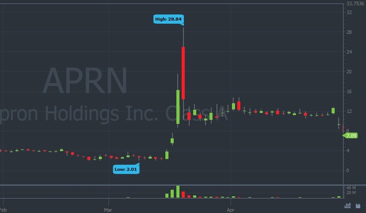
#1 The Supernova
The supernova is one of my favorite chart patterns to play. Here’s your supernova mantra … repeat after me…
“I will trade volatile stocks.”
Supernovas occur when a low-float stock experiences high volume and high volatility. It’s an explosion in price that can provide many buying opportunities on the way up. Then there’s a huge price drop that can provide short-selling opportunities on the way down.
(Need help navigating volatility? Get my no-cost two-hour “Volatility Survival Guide” and learn how.)
Nearly anything can trigger a supernova — news, world events, hype, Twitter — I’ve seen it all. Be careful. Sometimes supernovas last longer or go bigger than you expect.
Example of The Supernova
#2 The Stair Stepper
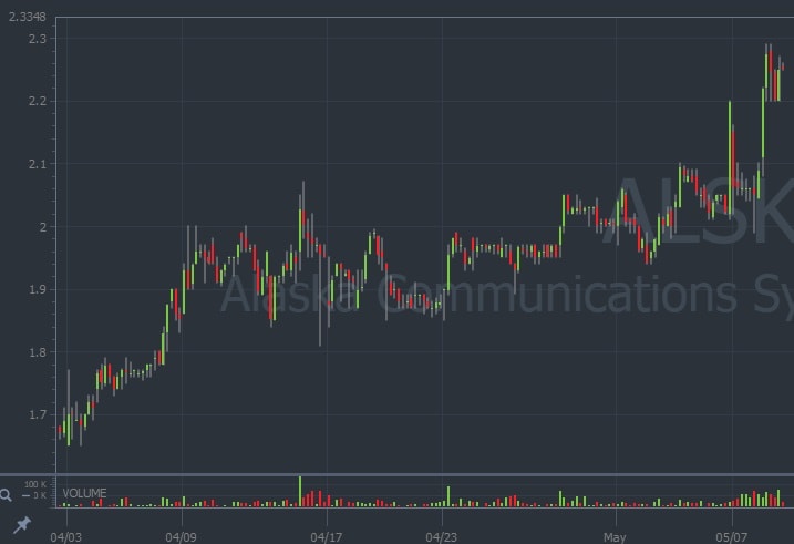
A stair-stepper is kinda like a slower supernova. It rises progressively with brief periods of pullback and consolidation. Some traders call the consolidation period sideways price action. It’s another of my favorite candlestick formations.
Be aware that the stair stepper can turn on you suddenly. If there’s no solid catalyst and the price keeps rising, eventually, it can crash back down.
This example of Alcoa Corporation (NYSE: AA) shows defined steps that act as both support and resistance at different times.
Example of The Stair Stepper
#3 The Snore
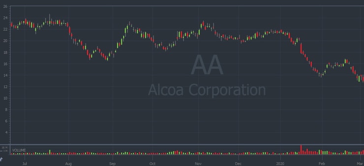
Let me sum up the snore in a few words: random chart with no real predictability. It’s boring — I don’t recommend trying to trade it.
I’m including it so you can avoid trading it. The obvious sign is a lack of price movement even with news that would normally be a catalyst.
The best thing to do with snores is to wait and watch. Remember, a stock’s pattern can change. That’s why you keep a watchlist.
(Sign up for my weekly watchlist here — it’s free of charge.)
Example of The Snore
#4 The Crow
Have you ever watched a crow pecking away at food? One bite at a time — it doesn’t stop until it’s all gone.
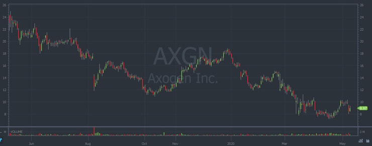
That’s what I see with this chart … a crow picking away at your money one chunk at a time until there’s nothing left. This pattern looks like a long, slow fall. The stock sinks lower and lower in price.
What causes it? Continuous selling pressure. Sometimes there’s a pushback — spurts of price strength — making it look almost like a reverse stair-stepper.
Here’s an example. The overall downtrend in this stock is clear. Every recovery is met with more selling.
Example of The Crow
#5 Shooting Star Pattern
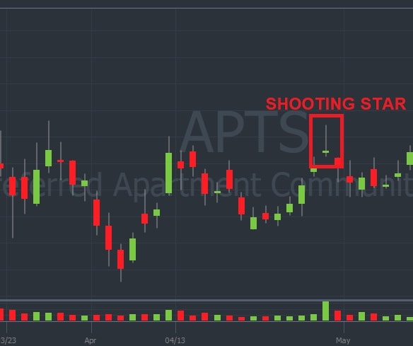
The shooting star is bearish and found at the top of an uptrend. It has a short body, a long upper shadow, and little or no lower shadow.
Look for three or more consecutive rising candles, each with higher highs. Then look for a candle with an upper shadow at least twice as long as the body.
During the time frame, the price rises high above the open, only to close near the open. Price action drives the price up, but it meets selling pressure. A shooting star can signify a bearish reversal. It has to be at the top of an upward trend to be considered a shooting star.
The downturn that comes afterward doesn’t last long. So with all patterns, it’s important to lock in profits or cut losses quickly.
Example of Shooting Star Pattern
#6 Hammer Doji
A doji candle occurs when the open and close are equal (or very close).
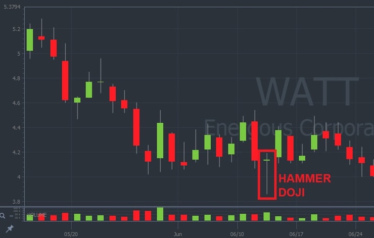
In a hammer doji, the open and close are virtually the same, but there’s a long lower shadow. It’s a bullish reversal pattern and signals the price could start to rise.
A traditional hammer candle looks like a hammer (right?), but the hammer doji has a thin head. By itself, it’s not a bullish signal. But it lets you know there’s a balance between the forces of buying and selling in that time period.
Despite sellers making some progress, the buyers balance everything out by the close.
Example of Hammer Doji
#7 Inverted Hammer Candle
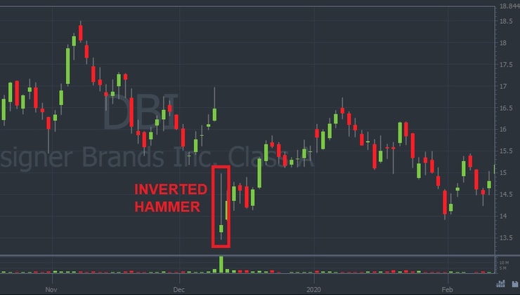
The inverted hammer looks like an upside-down hammer. The shadow extends above the short body.
This candle looks a lot like a shooting star … but it’s bullish rather than bearish. It’s found after a downtrend and can signal a bullish reversal.
While sellers push the price down, the buyers finally launch a counterattack.
The sellers push the price back down to where the counterattack started, but the buyers hold their ground near the open. This can indicate that support’s forming near the bottom of the hammer’s head.
Example of an Inverted Hammer Candle
#8 Spinning Top
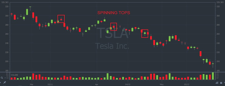
Spinning tops on their own aren’t significant — they’re everywhere and easy to spot…
That’s why it’s smart to learn to spot them. They can be part of larger patterns like the three line strikes we’ll look at next.
A spinning top can move up or down and is identified by a small body. But the body must be present, unlike a doji. It has a shadow on both sides with the body centered between the upper and lower shadow.
Example of Spinning Top
#9 Three Line Strike
A three line strike can be bullish or bearish depending on the direction of the candles. Don’t let the name fool you — this is a four-candle pattern. Let’s break it down…
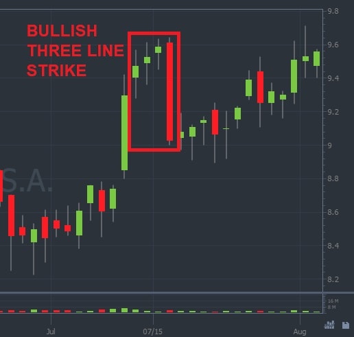
Bullish Three Line Strike
A bullish three line strike consists of three candles moving up, often spinning tops. Each candle must have a higher close than the previous candle, and each candle must have a higher low than the previous. We’re not concerned with the upper shadow or the open on these candles.
The fourth candle will retrace the progress the first three candles made. It must open above the previous close, then close below the first candle’s open.
Example of Bullish Three Line Strike
This is a dramatic example to really show you the concept. Take note of how old highs are retested within two weeks of the formation.
Bearish Three Line Strike
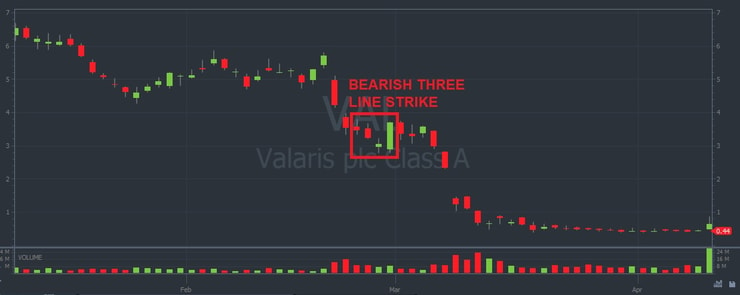
A bearish three line strike consists of three candles moving down. Each candle must have a lower close than the previous, and each candle must have a lower high than the previous.
We’re not concerned with the lower shadow or open on these first three candles.
The fourth candle will retrace the progress of the first three candles. It must open below the previous close, then close above the first candle’s open.
Example of Bearish Three Line Strike
This is a textbook example of a bearish continuation pattern.
#10 Two Black Gapping
This rare pattern doesn’t show up often. It can be an extremely powerful indication of a reversal. But make sure the pattern meets all the criteria before you trade something that ‘looks’ like it.
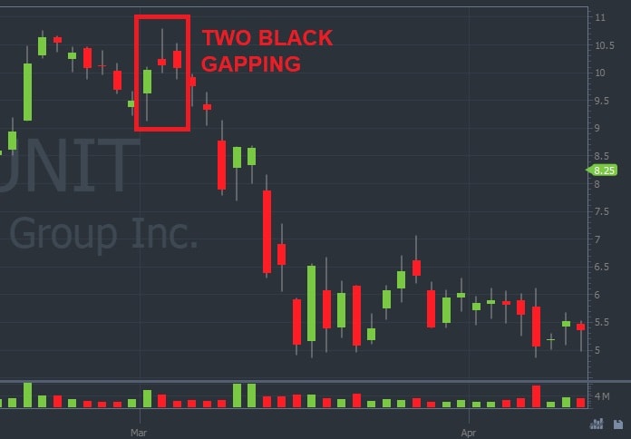
This is a bearish three-candle reversal pattern. The first green candle moves up as part of an overall uptrend or occurs near recent highs.
Then the second candle gaps up, opening higher than the previous close but closes lower than its open. The third candle gaps up again. It opens higher than the previous candle’s open, only to close below the previous candle’s close.
We’re not concerned with the shadows in this pattern … We want the candle bodies to confirm this pattern.
Example of Two Black Gapping
#11 Evening Star
An evening star is a bearish reversal pattern. This three-candle pattern is a favorite among new traders — it’s easy to spot. It looks just like a star in the sky.
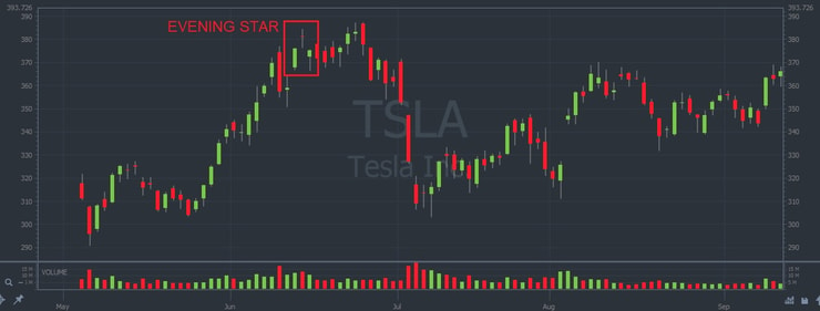
The first candle is green and part of an uptrend. The second candle’s body is higher than and won’t touch the first. Red or green — it doesn’t matter. The second candle is often a spinning top or doji.
The third candle’s entire body will be below the second candle. The final candle needs to close deep into the first candle’s body. After you see that close, bearish continuation will likely follow.
Example of Evening Star
In this example, the price eventually broke down, but not until after several more candles and a new high.
Take these patterns for what they are — signals. They don’t always form definitive lines.
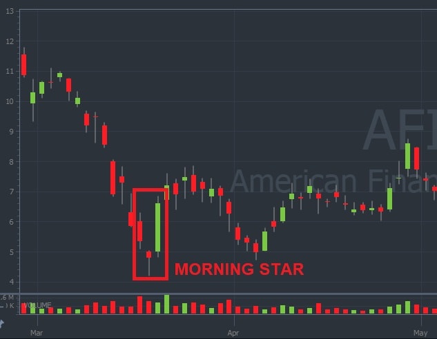
#12 Morning Star
A morning star is exactly the opposite of the evening star. This three-candle pattern is a bullish reversal pattern. And it’s important you don’t try to anticipate the third candle.
The first candle is red and part of a downtrend. The second candle’s body is lower than and won’t touch the first. Red or green, doesn’t matter. This second candle is often a spinning top or a doji.
The third candle’s entire body will be above the second candle. This final candle needs to close deep into or even above the first candle’s body. After you see that close, it’s likely a bullish continuation will follow.
Example of Morning Star
#13 Abandoned Baby
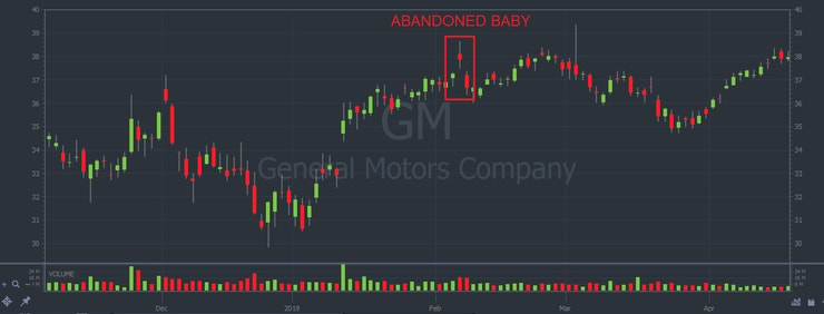
The abandoned baby takes it a step further than the stars we just looked at. It’s a three-candle pattern and can be bullish or bearish.
What separates an abandoned baby from either of the stars is that the candle’s shadows won’t overlap at all. The abandoned baby is truly abandoned — no contact with the other two candles at all.
Example of Abandon Baby
Here’s another example of why you need to take these patterns in context. The level established by this abandoned baby pattern serves as resistance afterward. There’s some bearish selling, but not a complete collapse.
#14 Piercing Line
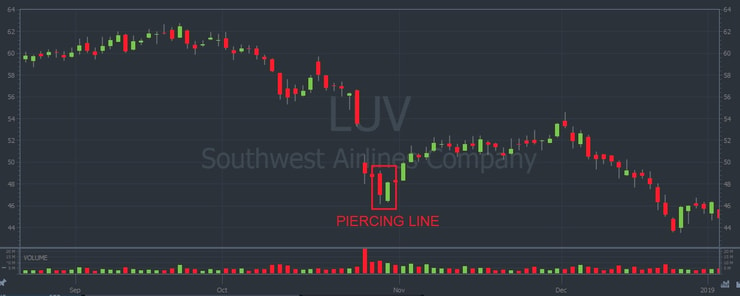
This is a two-candle bullish reversal pattern. The opposite is the dark cloud cover, which we’ll cover next.
The first candle is red, long, and part of an overall downtrend. The second candle opens below the body of the first but closes above the 50% line of the first candle.
The 50% line is important to note. A pierce smaller than that indicates the bulls aren’t being forceful and likely can’t follow through.
Example of Piercing Line
#15 Dark Cloud Cover
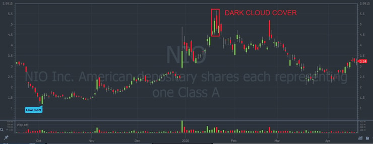
The dark cloud cover is a two-candle bearish reversal pattern. Just the opposite of the piercing line above.
The first candle is green, long, and part of an overall uptrend. The second candle will open above the body of the first but close below the 50% line of the first candle’s body.
Once again, the 50% line is important to note. Anything less than a 50% cover, and there’s no good reason to believe the bears are really in charge.
Example of Dark Cloud Cover
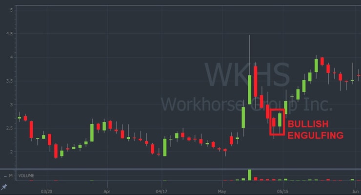
#16 Bullish Engulfing
Similar to the previous two patterns, engulfing patterns are more powerful and distinct than the pierce and cover.
Engulfing patterns are reversal patterns and can be bullish or bearish.
The bullish engulfing is a two-candle pattern and found in a downtrend. The first candle is long and red, showing the bears pushing lower strongly.
The second candle opens below the previous close but closes above the previous body’s open. The body of the second candle will completely ‘engulf’ the body of the first.
Example of Bullish Engulfing
Look closely at this example … There are actually two bullish engulfing patterns. I circled one for you. See if you can find the other on your own.
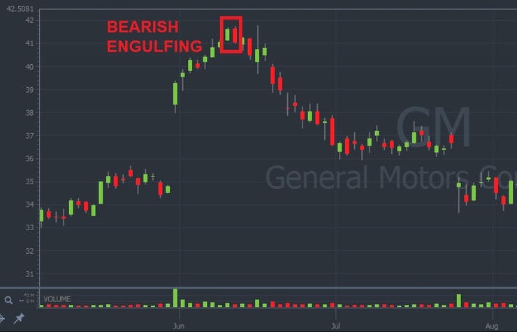
#17 Bearish Engulfing
The bearish engulfing is another two-candle pattern and found in an uptrend. The first candle is long and green, showing the bulls pushing up strongly.
The second candle opens above the previous close but closes below the previous body’s open. The body of the second candle completely ‘engulfs’ the body of the first.
Example of Bearish Engulfing
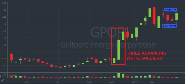
#18 Three Advancing White Soldiers
This is a sign of forcefulness in the market. When this pattern appears, it shows the market’s moving strongly and forcefully to the higher side.
This pattern is only three candles (unlike the three line strike) advancing up. These green candles each close near its high. The open of the second two should be within the body of the previous.
It’s not a great pattern to trade. But be mindful of the force at play. And it can easily have a dip immediately afterward. A solid risk/reward setup isn’t there.
Example of Three Advancing White Soldiers
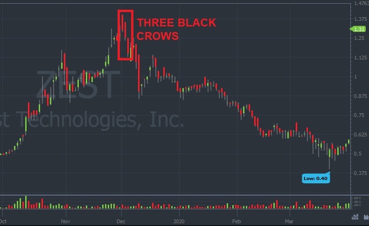
#19 Three Black Crows
The Japanese have an old adage, “bad news has wings.” Maybe that’s why they named this pattern after birds.
Like the previous soldier pattern, this forceful pattern doesn’t always present a good trading opportunity.
Look for three long red candles each closing lower than the last. The open of each candle should be in the previous candle’s body. Here’s a great example…
Example of Three Black Crows
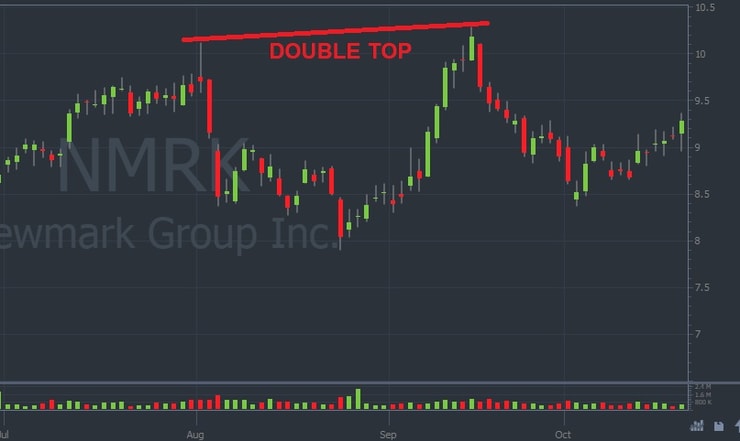
#20 Double Top
This is a clean, easy-to-recognize, trend-exhaustion pattern. It can quickly turn around, so be careful if you short. But watch for this to form if you hold a long position. Once you see it, consider a quick exit before the price falls lower.
The pattern looks like two mountain peaks, at or near the same level.
Example of Top Double
Candlestick Pattern Cheat Sheet
Here ‘s the cheat sheet I promised you at the beginning. It shows both the traditional white and black candlesticks along with the modern green and red.
The truth is, there’s no shortcut to learning these patterns. You have to study and understand the specific criteria for each. Don’t just rely on pictures.
If you want to continue studying these patterns check out Steve Nison’s “The Candlestick Course” as part of your overall course of study. And if you’re ready to learn more about trading penny stocks, check out “The Complete Penny Stock Course” by my student Jamil. It covers so many rules and basics essential for trading penny stocks.
(As an Amazon Associate, we earn from qualifying purchases.)
Bonus Tip: Never Stop Learning
I’ve only scratched the surface of candlestick patterns. If you’re serious about trading, you need to study this subject. A lot. Make it a habit. You should look at charts and try to find these patterns so you can identify them. They need to become second nature.
But there’s far more to trading than patterns. My top Trading Challenge students know that. You can never rely on a single indicator … but you can build your knowledge account and learn to trade smarter.
You have to apply to be a part of the Challenge … But if you’re accepted, you’ll have access to the best trading chat room, live trading sessions, webinars, DVDs, and so much more. You can’t find a better, more engaged trading community anywhere. Ready to join us? Apply for my Trading Challenge now.
The Bottom Line
Candlestick patterns are packed with information! I hope you see there’s a simple beauty here and that there’s so much to learn.
Just like anything in day trading, you can’t cheat success. So get to work! I hope to see you soon in my Trading Challenge!
Tell me about your favorite candlestick patterns in the comments below. Or if this is all new to you, I’d love to hear from you. Leave a comment!


Leave a reply