
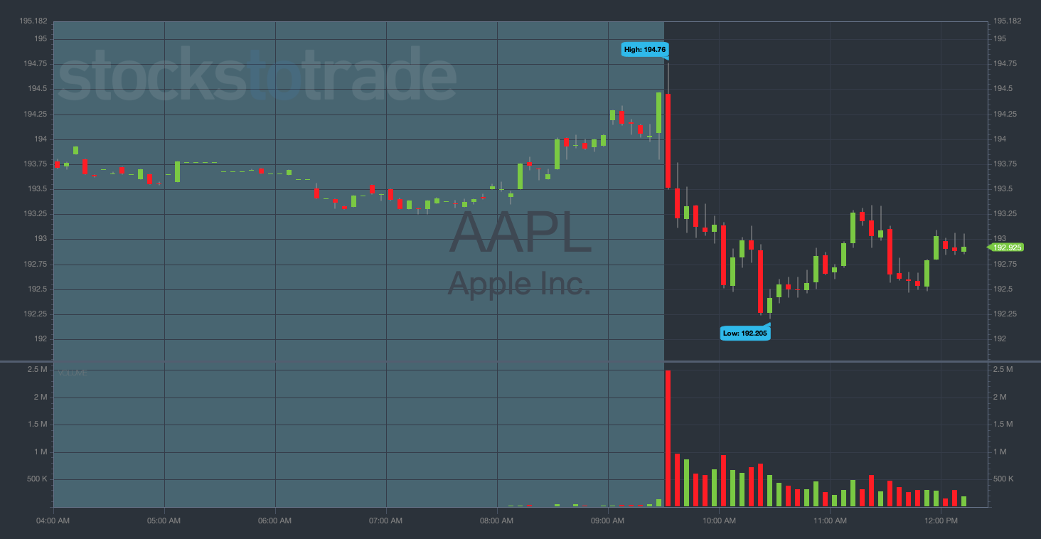
Candlestick charts, a technique developed in Japan over 100 years ago, are essential in trading, offering deep insights into market trends and price movements. Unlike simpler line charts, candlesticks display the open, close, high, and low prices for a particular period. The ‘body’ of the candlestick represents the opening and closing prices, while the ‘wicks’ or ‘shadows’ show the high and low. The color of the body indicates whether the closing price was higher or lower than the opening price, typically green for an increase and red for a decrease.
You should read this article because it offers a comprehensive guide on understanding and utilizing candlestick charts in trading, enhancing your ability to make informed decisions.
I’ll answer the following questions:
- What is a candlestick chart?
- How does a candlestick chart work?
- What are the benefits of using candlestick charts?
- What are the basic components of a candlestick chart?
- What are the basic candlestick patterns?
- How do candlestick charts compare to bar charts?
- How do you read a candlestick chart?
- What are some common candlestick patterns and their significance?
Let’s get to the content!
Table of Contents
- 1 What Is a Candlestick Chart?
- 2 Benefits of Using Candlestick Charts
- 3 Components of a Candlestick Chart
- 4 What Are the Basic Candlestick Patterns?
- 5 Technical Analysis With Candlestick Charts
- 6 Candlestick Charts vs. Bar Charts
- 7 How To Read a Candlestick Chart
- 8 Key Takeaways
- 9 Frequently Asked Questions
What Is a Candlestick Chart?
A candlestick chart is more than just lines and shadows; it’s a dynamic tool for visualizing price movements in the stock market. Originating from Japanese rice traders centuries ago, this type of chart has become a staple in technical analysis. Each candlestick represents the battle between buyers and sellers for a given period, providing a comprehensive picture of market sentiment. The chart is formed by individual candlesticks, each telling a unique story about the stock’s opening, closing, high, and low prices within that timeframe.
The Basics of a Candlestick

The essence of a candlestick lies in its simplicity yet profound information delivery. A single candlestick is composed of a body and wicks (or shadows). The body shows the opening and closing prices, while the wicks represent the high and low prices during the trading period. The color of the body indicates whether the closing price was higher or lower than the opening price, typically green for an increase and red for a decrease. This visual representation allows traders to quickly grasp the market’s direction and strength.
How Does a Candlestick Chart Work?
In my years of trading and teaching, I’ve seen how candlestick charts serve as a roadmap for market psychology. They work by layering the price action of successive time periods, creating a tapestry that illustrates the ongoing struggle between bullish and bearish forces. Recognizing patterns in these candlesticks is crucial. For example, a series of ascending candlesticks suggests an uptrend, while descending ones hint at a downtrend. Understanding these dynamics enables traders to make informed decisions about their trades.

Benefits of Using Candlestick Charts
Candlestick charts provide traders with a comprehensive view of market movements and the relationship between buyers and sellers. These charts are not just about tracking the price of an asset; they offer insights into market psychology. By understanding candlestick patterns, traders gain a better sense of control over their decisions, making them invaluable in the dynamic environment of stock trading.
Additionally, these charts can highlight significant market events, such as earnings reports or economic announcements, through their patterns and formations.
Some specific patterns, like the Marubozu, indicate more than just price action. This pattern, characterized by a long body without wicks, signals a dominant buying or selling pressure. Its appearance can be a critical factor in decision-making, especially in identifying robust trends or potential reversals. To understand how the Marubozu candlestick can enhance your trading strategy, get into my in-depth analysis of the Marubozu candlestick pattern.
Visual Representation of Price Action
Candlestick charts excel in visually representing price action. Each candlestick’s size and color convey vital information about the market’s mood. In my experience, this visual clarity helps in quickly deciphering bullish or bearish trends, making it invaluable for both novice and seasoned traders.
Quick Interpretation of Market Sentiment
Market sentiment is vividly captured in candlestick charts. For example, a long green candlestick indicates strong buying pressure, while a long red one suggests dominant selling. This quick interpretation of market sentiment is crucial in making timely trading decisions.
Identification of Reversal and Continuation Patterns
Candlesticks are renowned for highlighting reversal patterns like ‘hammer’ and ‘doji,’ which signal a potential change in market direction. Continuation patterns, on the other hand, suggest the ongoing trend will persist. Recognizing these patterns is key in making informed trading decisions.
Enhanced Timing for Entry and Exit Points
By analyzing candlestick patterns, traders can pinpoint optimal entry and exit points. This aspect of candlesticks has been fundamental in my trading strategy, allowing for precision in timing trades.
Compatibility with Other Technical Analysis Tools
Candlestick charts integrate seamlessly with other technical analysis tools. Whether it’s combining them with moving averages, RSI, or support and resistance levels, they enhance the effectiveness of these tools.
Applicability Across Different Time Frames
Whether you’re a day trader or a long-term investor, candlestick charts are versatile across various time frames. This adaptability makes them invaluable for all types of traders.
Components of a Candlestick Chart
A candlestick chart is made up of individual ‘candlesticks’ that represent price movements of an asset over a set period. Each candlestick has a ‘body’ that shows the opening and closing prices and ‘wicks’ that indicate the high and low points. This structure provides a clear picture of the market’s movements, allowing traders to observe gaps between trading periods. Gaps can be significant indicators of market sentiment, often occurring due to overnight news or events impacting the stock. Understanding these components is crucial for anyone looking to trade in the stock markets effectively.
Price Movement
The primary component of a candlestick chart is price movement. Each candlestick provides a visual summary of the price movements within a chosen time frame, revealing the battle between buyers and sellers.
Time Period
Each candlestick represents a specific time period, which can range from a minute to a month. This flexibility allows traders to tailor their analysis to their trading style and goals.
Lowest Prices and Highest Prices
The top and bottom of the wicks represent the highest and lowest prices traded during the period. These points are crucial in identifying market volatility and potential price extremes.
Real Body and Upper Wick/Lower Wick
The ‘real body’ of a candlestick shows the range between the opening and closing prices. The wicks indicate the high and low. A long body signifies strong buying or selling pressure, while a short body indicates a more indecisive market.
What Are the Basic Candlestick Patterns?
Candlestick patterns are the foundation of technical analysis in trading. Basic patterns like the ‘morning star,’ a bullish reversal pattern, provide traders with cues about potential market turns.
These patterns help in predicting the future direction of stock prices, enabling traders to make informed decisions. The understanding of these patterns is not just about recognizing shapes on a chart; it’s about interpreting the story of the market, the push and pull between bullish and bearish forces, and how events and market sentiment are shaping the movement of stocks.
There’s much more to discover about candlestick patterns. Each pattern offers unique insights into market behavior, helping traders anticipate potential price movements. Understanding a wide range of patterns is key to developing a nuanced approach to market analysis. For a comprehensive exploration of candlestick patterns and their implications in trading, check out my detailed guide on candlestick patterns.
Bearish Engulfing Pattern
This pattern occurs when a small bullish candle is followed by a large bearish candle, engulfing the previous one. It signals a potential reversal from an uptrend to a downtrend.

Bullish Engulfing Pattern
Conversely, a bullish engulfing pattern forms when a small bearish candle is followed by a larger bullish candle, indicating a potential shift from a downtrend to an uptrend.

Bearish Evening Star
A bearish evening star is a three-candle pattern indicating a reversal in an uptrend. It starts with a large bullish candle, followed by a small-bodied candle and then a large bearish candle.

Bearish Harami
This pattern consists of a large candle followed by a smaller candle, signaling a decrease in a stock’s momentum and potentially a bearish reversal.
Bullish Harami
A bullish harami, the opposite of a bearish harami, may indicate a shift from a downtrend to an uptrend.
Bearish Harami Cross
The bearish harami cross is a variant of the bearish harami but with a doji as the second candle, suggesting a stronger potential for reversal.
Bullish Harami Cross
The bullish harami cross, similar to its bearish counterpart, features a doji, indicating indecision but with potential bullish implications.
Bullish Rising Three
This pattern consists of a long bullish candle, followed by three small bearish candles, and then another long bullish candle. It’s a sign of continuation in an uptrend.
Bearish Falling Three
The bearish falling three, a mirror of the bullish rising three, signals continuation in a downtrend.
Technical Analysis With Candlestick Charts
Incorporating candlestick charts into technical analysis enhances the understanding of market trends and trader psychology. By analyzing patterns, traders can predict future price movements with greater confidence. As a seasoned trader, I’ve found that combining candlestick analysis with indicators like volume and momentum can provide a more comprehensive market view.
Understanding candlestick reversal patterns is crucial for predicting shifts in market trends. These patterns, such as the ‘hammer’ and ‘doji,’ serve as key indicators of potential reversals in price direction. Recognizing these patterns early can provide traders with a significant advantage in timing their trades. For an in-depth look at candlestick reversal patterns and how to effectively incorporate them into your trading strategy, explore my comprehensive guide on candlestick reversal patterns.
Candlestick Charts vs. Bar Charts
The main difference between candlestick charts and bar charts lies in their visual representation of price movements. Candlesticks provide a more detailed and intuitive visual representation, making them superior for understanding market sentiment and potential price movements.
How To Read a Candlestick Chart
Reading a candlestick chart involves more than just looking at the price movements of an asset; it requires an understanding of the underlying market dynamics. Each candlestick tells a story of the battle between bulls and bears, revealing who’s in control at any given moment. By analyzing how candlesticks group together, traders can infer potential market directions. For example, a series of candlesticks with small bodies could indicate a period of indecision or a consolidation before a significant move. Articles and resources on candlestick patterns provide a wealth of knowledge for traders looking to deepen their understanding of market trends and movements.
Understand the Basic Structure of a Candlestick
Familiarize yourself with the candlestick’s components: the body and the wicks. These elements illustrate the opening, closing, high, and low prices.
Differentiate Bullish and Bearish Candles
Identify bullish and bearish candles through their color and positioning. Bullish candles typically have a closing price higher than the opening, while bearish candles close lower than they open.
Interpret the Significance of Candlestick Colors
Colors in candlestick charts are not standardized but generally, green or white signifies a bullish candle, and red or black indicates a bearish candle.
Analyze the Length of Wicks for Market Sentiment
Long wicks represent significant price rejection, while short wicks indicate minimal price movement outside the open and close range.
Read Patterns in Multiple Candlestick Formations
Understanding patterns formed by groups of candlesticks is crucial. These patterns can signal continuations or reversals in the market trend.
Recognize Common Candlestick Patterns
Learn to identify key patterns like doji, hammer, engulfing, and harami. These patterns provide valuable insights into market sentiment and potential price movements.
Key Takeaways
- Candlestick charts are a vital tool for analyzing market trends and price movements.
- Understanding candlestick patterns can greatly enhance trading decisions.
- These charts are versatile, applicable across various time frames and compatible with other technical analysis tools.
- Recognizing bullish and bearish patterns in candlesticks is essential for predicting market movements.
Trading isn’t rocket science. It’s a skill you build and work on like any other. Trading has changed my life, and I think this way of life should be open to more people…
I’ve built my Trading Challenge to pass on the things I had to learn for myself. It’s the kind of community that I wish I had when I was starting out.
We don’t accept everyone. If you’re up for the challenge — I want to hear from you.
Apply to the Trading Challenge here.
Trading is a battlefield. The more knowledge you have, the better prepared you’ll be.
Do you use candlestick charts in your trading strategy? Let me know in the comments — I love hearing from my readers!
Frequently Asked Questions
What Candlestick Pattern is the Most Accurate?
No single candlestick pattern is universally the most accurate. However, patterns like the engulfing and harami are highly regarded for their reliability in signaling trend reversals.
How Do You Interpret CandleSticks?
Interpreting candlesticks involves analyzing their shape, color, and the context within which they appear. This includes looking at the length of the body and wicks, the color of the body, and the pattern they form with adjacent candlesticks.
What Is the 3 Candlestick Rule?
The 3 candlestick rule refers to a pattern involving three consecutive candlesticks, often used to predict a continuation or reversal in the market trend.

Leave a reply